“Since many of the colours for medical devices fall on the light end of the spectrum, RAL Design can help communicate tiny differences between extremely light colours.”
– Ray Wills
The Perfect Match: Communicating Colour for Product Development
Did you know that 2015 is the International Year of Light and Light-Based Technologies? Manchester recently held the 28th Quadrennial Session, CIE International Commission on Illumination, bringing together scientists from around the globe to discuss advancements in light. As we know, the way light behaves impacts the colours we see. The same colour on a glossy surface can look very different on a surface that is matte.
For product developers, understanding how to measure and communicate colour is an important skill to develop. From solid plastics to glossy print on packaging, translating the same colour across mediums can be a complicated and time consuming task. Luckily it doesn’t have to be if you know the right framework to use.
Introduction to colour for 3D objects
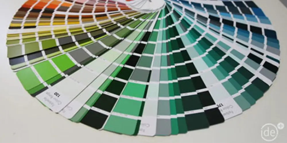
RAL Design is a colour set similar to the Pantone colours many people are familiar with. However unlike Pantone, the RAL Design colour set is based on the CIElab colour space.
CIElab colour space is used as the basis for the DIN6174 Standard for the Colorimetric Evaluation of Colour Differences of Surface Colours and was developed by the International Commission for Illumination. This is particularly relevant for product developers because this Standard is specifically for use with 3 dimensional objects.
The RAL system uses a three number set to identify colours:
L = Hue or Colour,
A = Value or Brightness,
B = Chroma or Intensity.
Every colour in the set is measured in five point increments along three variables – Hue, Value and Chroma.
The benefits of using RAL Design for product development
Have you ever tried matching a slight colour variation using the Pantone set and found it difficult and time consuming? This is because Pantone does not operate on a framework. Unlike Pantone, RAL Design is based on the CIElab system which allows you to match a completely new colour – even if it is not included in the set.
RAL Design provides a framework that can be easily followed. It enables you to translate colour differences with manufacturers to achieve the most accurate colour outcomes possible.
For the team at ide, this accuracy is particularly important when developing medical devices. Since many of the colours for medical devices fall on the light end of the spectrum, RAL Design can help communicate tiny differences between extremely light colours.
Resources


